homework_1 (Turning Table into Graph)
The table showed age-adjusted annual incidence and mortality rates (per 100 000 person-years), disability-adjusted life-years (DALYs) lost, prevalence (per 100 000 people), and mortality-to-incidence ratio (MIR) by age groups in high-income and low-income and middle-income countries, and globally in 1990, 2005, and 2010. Here, we will make a graph of the mortality values (by age group, year, and country income group).
Reading the data, we have four variables: year, mortality (rates and intervals), age group and country income group.
Usually we regard year as the x-axis, mortality rates as y-axis, and add error bar or lines for the mortality intervals. Age group and country income group could be two factors. First, we could summarize the data and organize the variables nicely. Second, we should visualize the data.

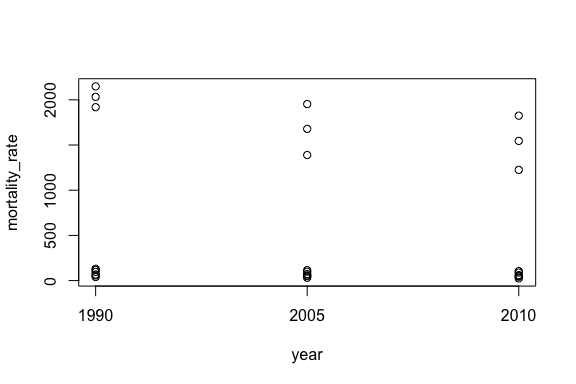
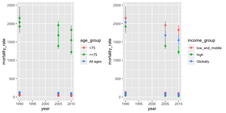
After looking at the relation between year and mortality rate, there is a scale problem. So we need to find out what causes this problem. Then, we look at the association between year and mortality rate by different factors.

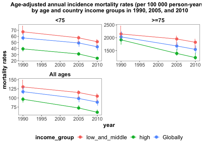
The left graph is the association between year and mortality by age group and the right one is the association between year and mortality by income group. According to the two graphs, we could see the age group is the main cause of the scale problem we mentioned earlier. Therefore we should plot the mortality of age group separately. Also the error bars are overlapped, we should use position_dodge to move them horizontally.

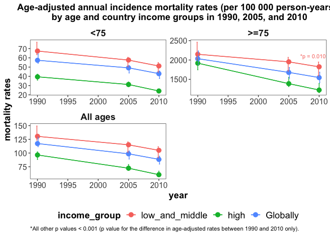
Now, the graph above shows the information about the mortality rates and intervals by year, age group and income group. Also, we could add the p value or asterisk to the graph.

If we want to know the specific mortality rates and 95% confidence interval, we could add these numbers to the plot. I don’t think it’s necessary, so I won’t show the graph here, but I’ll put the code in an appendix. The table in the paper also showed the Incidence, Prevalence, MIR and DALYs lost by age groups in high-income and low-income and middle-income countries, and globally in 1990, 2005, and 2010. We could make another four panels to include all of the information in the table. Similarly, the other four panels also have three facets for each age group.
References
@article{feigin2014global, title={Global and regional burden of stroke during 1990–2010: findings from the Global Burden of Disease Study 2010}, author={Feigin, Valery L and Forouzanfar, Mohammad H and Krishnamurthi, Rita and Mensah, George A and Connor, Myles and Bennett, Derrick A and Moran, Andrew E and Sacco, Ralph L and Anderson, Laurie and Truelsen, Thomas and others}, journal={The Lancet}, volume={383}, number={9913}, pages={245–255}, year={2014}, publisher={Elsevier} }
Appendix
par(mfrow=c(1,1))
library(dplyr)
library(forcats)
library(ggplot2)
library(gridExtra)
# Read data
mortality <- read.csv(file="feigin2014_table1_mortality.csv", header=TRUE, sep=",")

# Summarize the data
age_level<- c("<75",">=75","All ages")
income_level<- c("low_and_middle","high","Globally")
mortality <- mortality %>% mutate(age_group = factor(age_group),
                                  income_group = factor(income_group),
                                  age_group =recode(age_group, "all" = "All ages"),
                                  income_group = recode(income_group, "all" = "Globally"),
                                  age_group = fct_relevel(age_group, age_level),
                                  income_group = fct_relevel(income_group, income_level))

# Visualize data #
stripchart(mortality_rate ~ year, vertical = TRUE, pch = 1, xlab = "year", data = mortality)

p1<-ggplot(mortality, aes(x=year, y=mortality_rate, color=age_group))+
  geom_point(size=2,alpha=0.8)+
  geom_errorbar(aes(ymin=interval_low, ymax=interval_high), width=.1)
p2<-ggplot(mortality, aes(x=year, y=mortality_rate, color=income_group))+
  geom_point(size=2,alpha=0.8)+
  geom_errorbar(aes(ymin=interval_low, ymax=interval_high), width=.1)
grid.arrange(p1, p2, nrow = 1)

# Better plot
library(egg)
library(ggtext)
# The errorbars overlapped, so use position_dodge to move them horizontally
pd <- position_dodge(0.3) # move them .05 to the left and right
title <- "Age-adjusted annual incidence mortality rates (per 100 000 person-years) \n by age and country income groups in 1990, 2005, and 2010"

p<-ggplot(mortality, aes(year, mortality_rate, colour = factor(income_group))) +
  geom_point(size = 3) + facet_wrap(~ age_group, ncol = 2, scales = "free") +
  geom_errorbar(aes(ymin=interval_low, ymax=interval_high), width=.5, position=pd) +
  geom_line(position=pd)+
  geom_path()+
  theme_article()+
  labs(colour = "income_group", title = title,
       x= "year",y = "mortality rates")+
  theme(axis.text=element_text(size=12),
        axis.title=element_text(size=14,face="bold"),
        plot.title = element_text(size=14,face="bold",hjust = 0.5),
        strip.text = element_text(size=14,face="bold"),
        legend.text=element_text(size=14),
        legend.title=element_text(size=14, face="bold"), legend.position = "bottom")

#Add p value
ann_text <- data.frame(year = 2009,mortality_rate = 2100,lab = "text",
                       income_group = factor("low_and_middle",levels = c("low_and_middle", "high","Globally")),
                       age_group = factor(">=75",levels = c("<75", ">=75","All ages")))
p <- p + geom_text(data = ann_text,label = "*p = 0.010",size = 3,show.legend = F)+
  labs(caption = "*All other p values < 0.001 (p value for the difference in age-adjusted rates between 1990 and 2010 only).")+
  theme(plot.caption = element_text(hjust = 0))

#Add mortality rates and 95%CI
library(ggrepel)
p +  geom_text_repel(
    aes(label = paste(mortality_rate,"(",interval_low,",",interval_high,")")),
    size = 2,
    fontface = 'bold',
    box.padding = unit(0.5, "lines"),
    point.padding = unit(0.5, "lines")
  )